
TickerTrends 2024 Election Prediction | TickerTrends.io

TickerTrends leverages consumer focused alternative data to identify opportunities in global financial markets. We express these views both through enterprise data products and our hedge fund. To learn more about TickerTrends visit our website tickertrends.io or contact us admin@tickertrends.io.

Prediction:

We believe that AZ has the potential to lean red which would further secure the likelihood of Trump's ability to win even in the scenario of Harris winning PA.
Full Research:
View a preview below:
Overview:
In the race to predict the outcomes of the US elections, traditional polling methods have faced challenges in capturing the pulse of the nation. Enter the new frontier: alternative data. By harnessing alternative data insights including but not limited to Google Trends, TikTok hashtag volume, Amazon search volume, Wikipedia page traffic, Reddit community growth, and candidate website visits, we're uncovering real-time shifts in voter sentiment. This data-driven approach allows us to see beyond the polls and into the behaviors and interests of everyday Americans, providing a fresh, dynamic perspective on where the electorate is heading as Election Day approaches.
Our first focus will be the national popular vote, where we'll dive into a broad keyword analysis to gauge two critical factors: general voter enthusiasm and candidate-specific momentum. By tracking the volume and trends of searches related to voting logistics and broad political issues, we can assess the overall excitement and turnout expectations for this election cycle. Simultaneously, we'll analyze candidate-specific keywords, social media engagement, and digital buzz to measure which candidates are resonating most with the public. This dual approach allows us to map both the general mood of the electorate and the intensity of support for individual contenders - Kamala Harris vs. Donald Trump.
National Turnout Expectations
Throughout this article we will use the 2016 and 2020 elections as a baseline when trying to normalize the data.


Predicting voter turnout requires a nuanced approach, especially when dealing with keyword data from sources like Google Trends. One of the key challenges is normalizing data across various terms, as certain keywords can display persistent, skewed trends. For example, searches like "register Republican" often outpace "register Democrat" in many states, despite Democrats frequently winning the popular vote in recent elections. This discrepancy means that raw keyword volumes don’t directly translate into voter turnout predictions. To address this, we apply normalization techniques that adjust for historical search patterns and regional differences, ensuring that we can more accurately reflect changes in engagement and interest. This helps create a more balanced view of voter enthusiasm across the political spectrum, ultimately leading to more accurate turnout forecasts.
This normalization process is crucial not only for analyzing Google Trends but also for making sense of other data sources with inherent biases. For instance, Reddit tends to have a left-wing bias, with communities that often lean progressive, while platforms like Twitter (now X) historically skew more right-wing in their user base and discourse. Without proper adjustments, this can create a distorted view of political sentiment if taken at face value. By normalizing these differences—adjusting for the typical baseline of activity on each platform—we can filter out noise and better capture shifts in engagement levels. This ensures that our predictions aren’t just reflecting the biases of individual platforms, but are instead providing a more accurate picture of the broader political landscape.
On Glimpse, we can add up keyword search volume for “vote”, to see the following:


2016 Total Turnout: 136.5M
2020 Total Turnout: 158.38M

We see that the number of searches for “vote” is far underperforming the Google Search interest levels of 2020, and much closer to 2016 levels. Plotted on a dual axis chart, the historical election turnout and the turn “vote” are very correlated. This makes it an essential datapoint to consider when forecasting the total turnout of the election, especially right after October ends and we gain that additional monthly datapoint. Right now, we are tracking much closer to 140M turnout vs the over 158M of the 2020 presidential election.
Data Biases:
Incomplete data may give a false picture of what turnout might be until a little later in the election cycle closer to November. The keyword is also not meant to be an exact representation / prediction. For example, 2008 modeled turnout based on “vote” was off. A high turnout election happened that year but search trends were down.
Approach #1: Google Trends Vote Keywords
In this prediction approach, we attempt to identify Google Search keywords that have historically had some predictive power in the past and attempt to draw conclusions from said data.
We track how certain keywords that may track societal interest in voting interest in both candidates did for the 2016 and 2020 elections comparing the following:
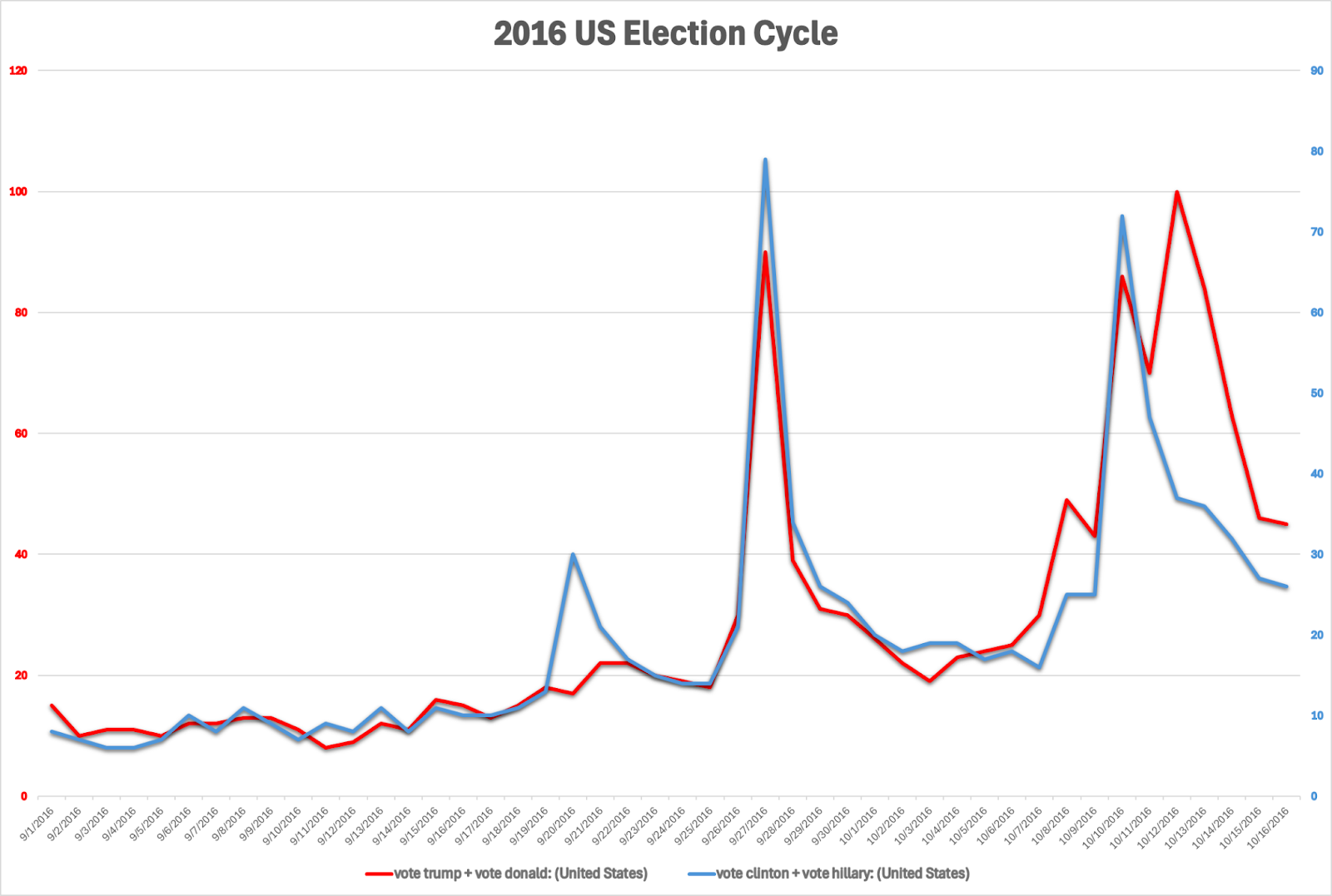
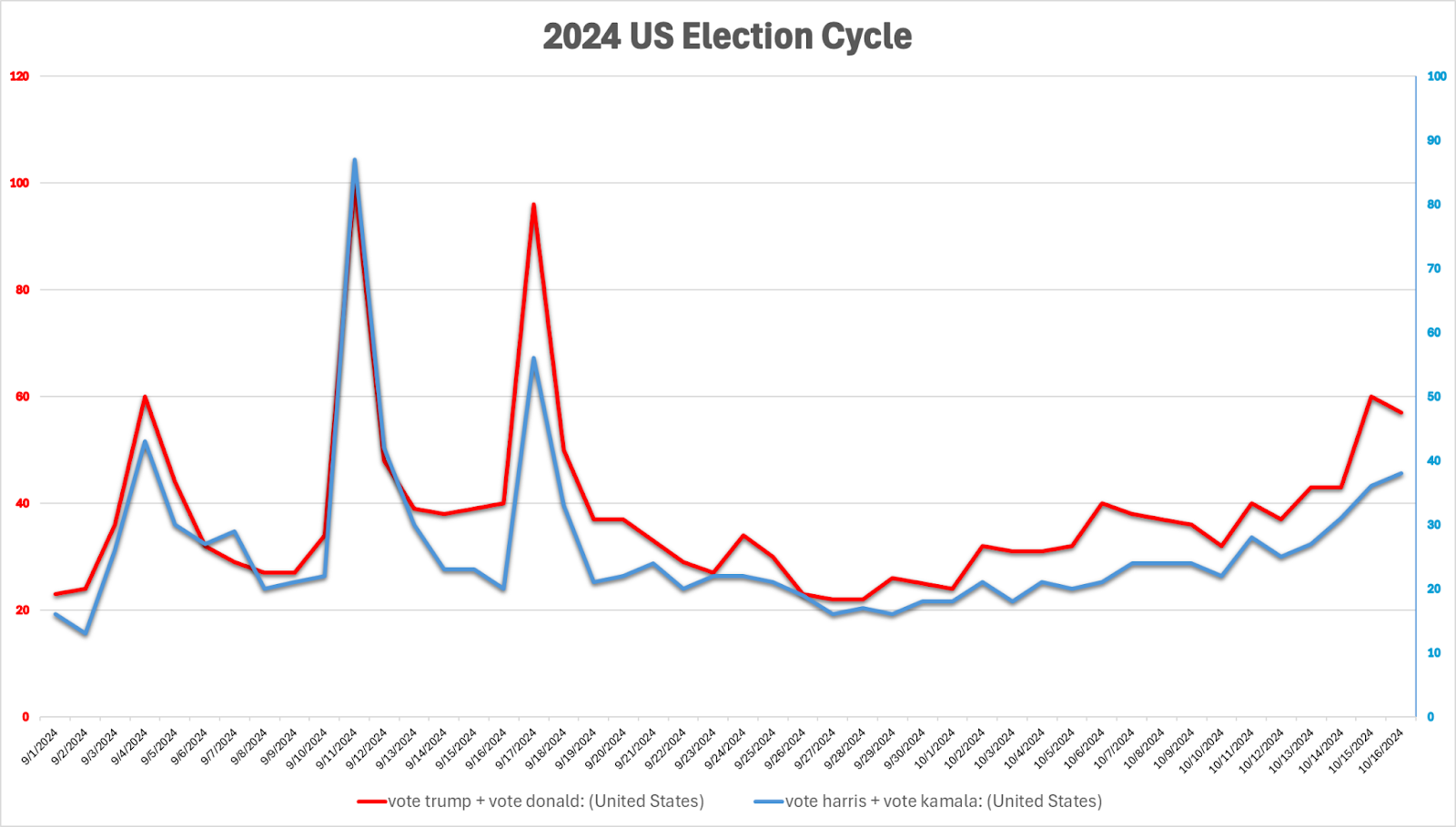
2016: “Vote Trump + Vote Donald” vs “Vote Clinton + Vote Hillary” & “Vote Blue” vs “Vote Red”
2020: “Vote Trump + Vote Donald” vs “Vote Biden + Vote Joe” & “Vote Blue” vs “Vote Red”
2024: “Vote Trump + Vote Donald” vs “Vote Harris + Vote Kamala” & “Vote Blue” vs “Vote Red”
These keywords sum up a section of voting interest in each candidate and the race, and allow us to see how Kamala Harris is performing versus Hillary Clinton and Joe Biden around this time in mid-October.
First, we will show the aggregate running total sum of the time series Google Trends shows for “Vote Blue” vs “Vote Red”. Then, we show the trailing 6-week sum of the respective time series’, to showcase shorter term fluctuations in these keywords.

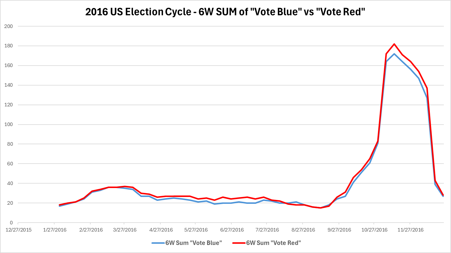


We see that for 2016 and 2020, “Vote Blue” and “Vote Red” were actually quite good indicators of the national mood, and election results. We also notice that “Vote Blue”, similar to 2016, was lagging behind “Vote Red” heavily, a major warning sign for the Democrats, but when Kamala Harris became the presumptive Democratic nominee in July 2024, “Vote Blue” trends picked back up. This is a potential sign of an energized Democratic voter base, who craved a younger, more vibrant candidate than Joe Biden.
Next, we will look at how “vote” followed by search interest for the specific candidate’s first and last name did in each election cycle. This combined Google Trends term eliminates the potential bias of people using only a candidate’s first or last name more frequently in general.

Outcome:
We see that Kamala Harris on the basis looks more similar to Biden’s 2020 results based on the “vote blue” vs “vote red” analysis shown however is in between Hillary Clinton and Joe Biden’s trends relative to Donald Trump’s in the “vote trump + vote donald” vs “vote harris + vote kamala” analysis. Do note, that search interest for Trump, in absolute terms, is always a bit higher than anyone else, so this is why thinking in relative terms makes more sense. This approach yields a Kamala Harris edge over Donald Trump.
Biases:
This approach is more indicative of popular vote / whole United States trends than any one individual swing state that may determine the Electoral College winner (and thus overall candidate winner) of the election.
Most people will simply vote and not necessarily search many terms like the ones shown. It is also no guarantee that voters who do search “vote trump” will actually vote for Trump, and vice versa for Harris-related searches. Many people may simply be curious about the search results that show up.
There were some large events that might be skewing the search data more than normal this year: the Trump Assassination Attempt and Biden dropping out of the race at the last minute for Harris. The effect of these large Black Swan events makes it reasonable to question the data accuracy / predictive capabilities of these keywords during this election cycle.
Note: In the week of Kamala entering the race, we averaged the Google Trends “Vote Blue”, “Vote Red” data points of the week before and week after to try to smooth out the bias of the one-time spike of vote interest on the Democratic side. This helps make the results comparable again relative to each other and previous elections.